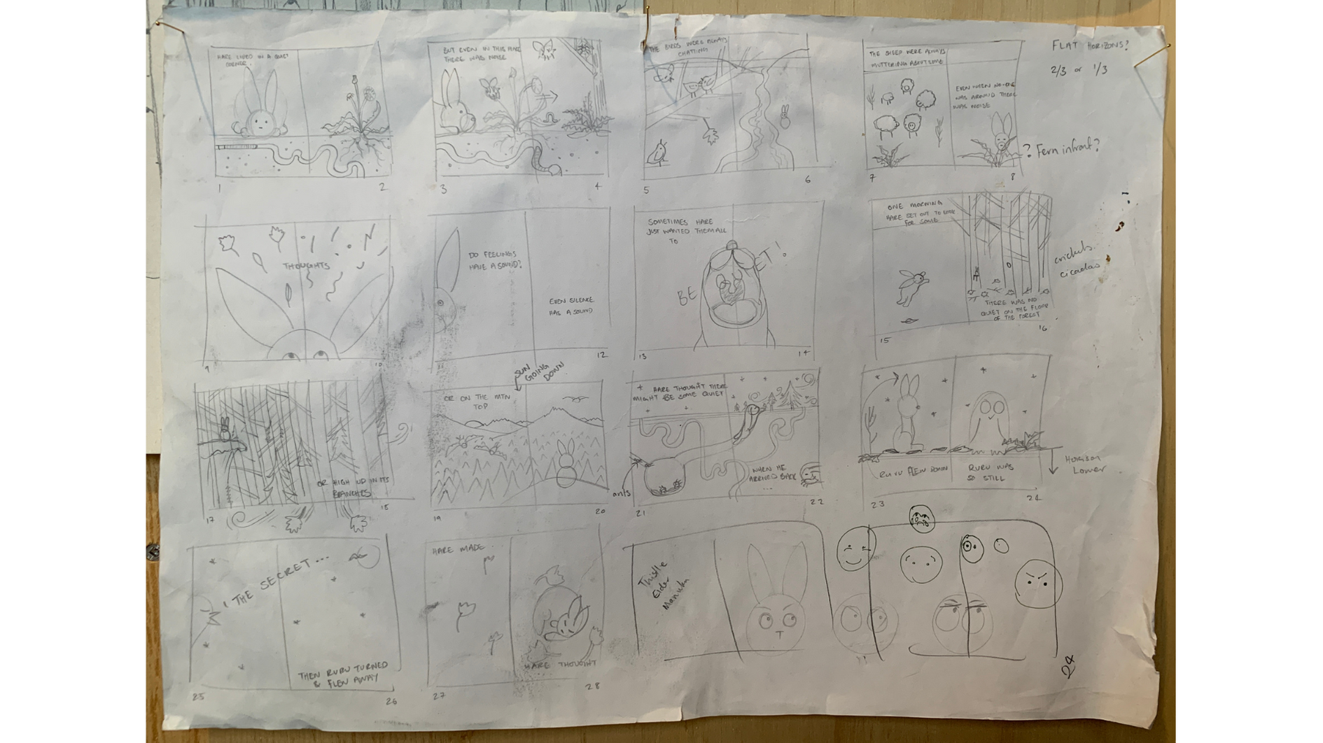
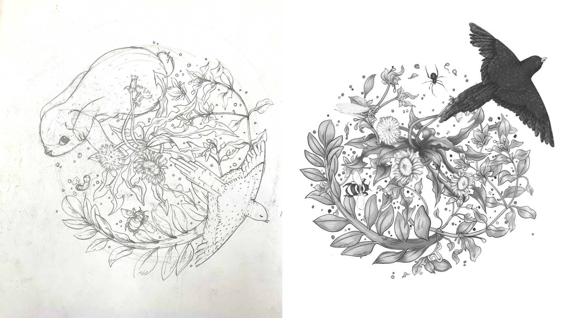
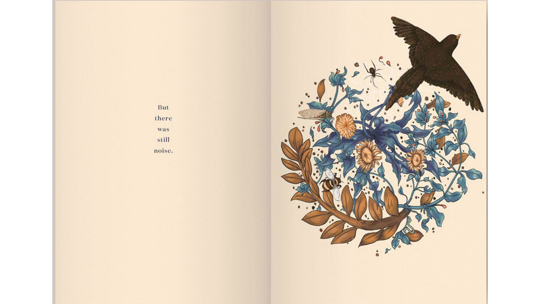
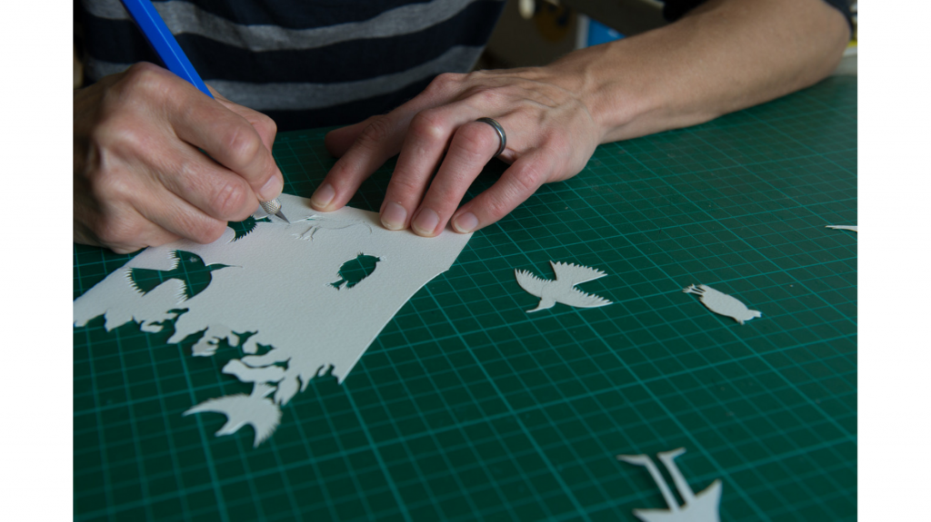
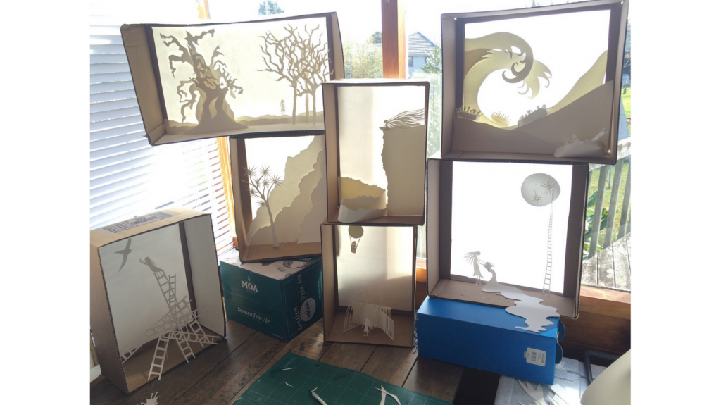
This year we’re kicking off our NZCYA Awards coverage with the Russell Clark Award for Illustration finalists! We have some exclusive insights into the process of creating the illustrations for each book, including storyboards, mood boards, working sketches, hand cutting and gluing, spectacular interior spreads, and even a sneak peek into the art that didn’t make the final cut – scroll down to see!
Thanks to the Book Awards Trust for the book descriptions.
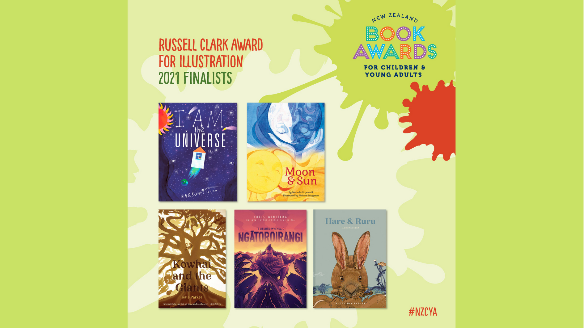
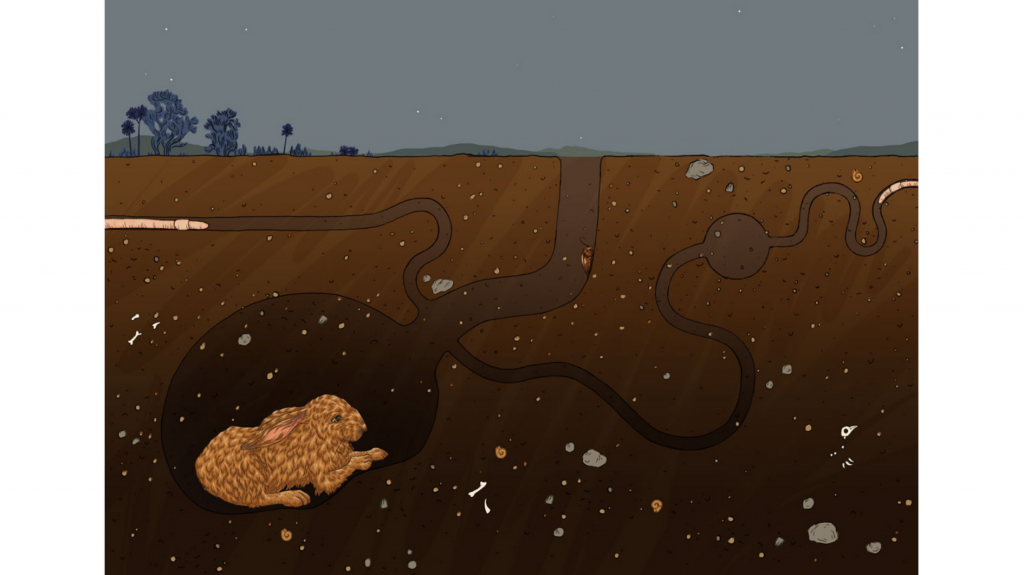
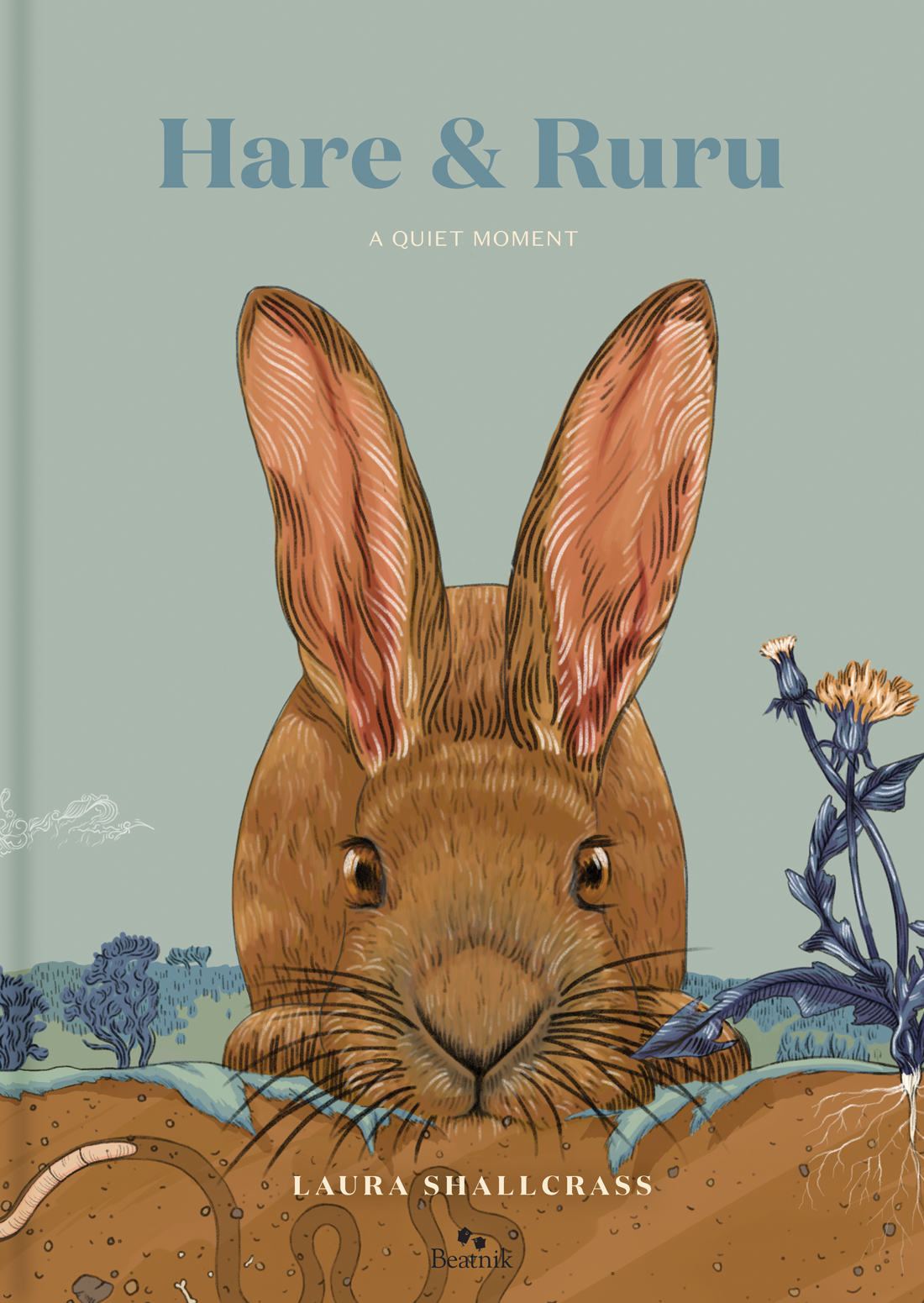
Hare’s desperate pursuit of peace is illustrated using a soft colour palette of blues and browns. Cross sections and ‘hare-level’ views allow readers to connect with Hare, hearing noises from above and below the earth. Moments of silence and sound are created through the use of negative space. Lastly, the view turns from the light earth to the dark heavens, and Ruru’s wise message about how to find quiet.
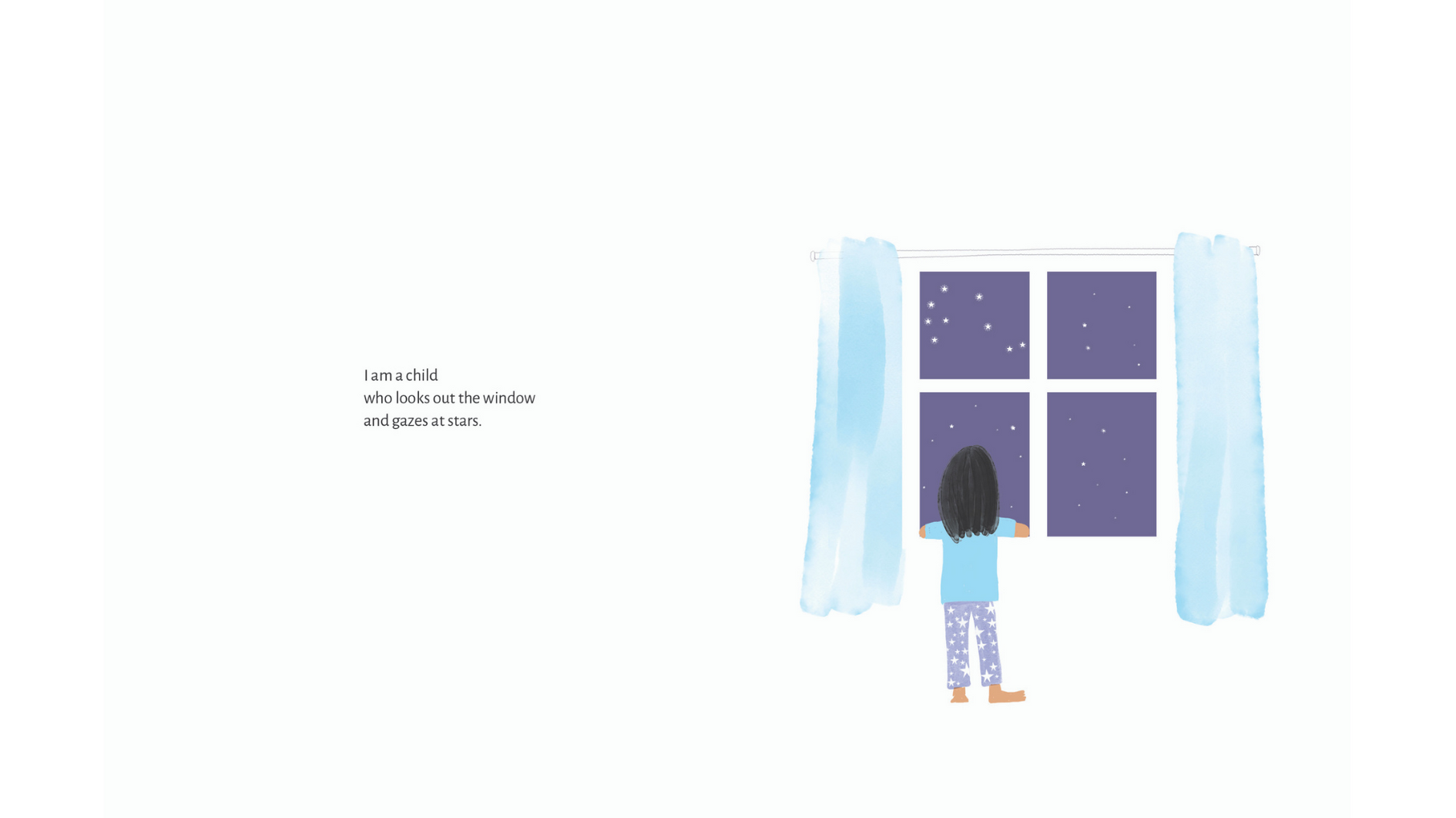
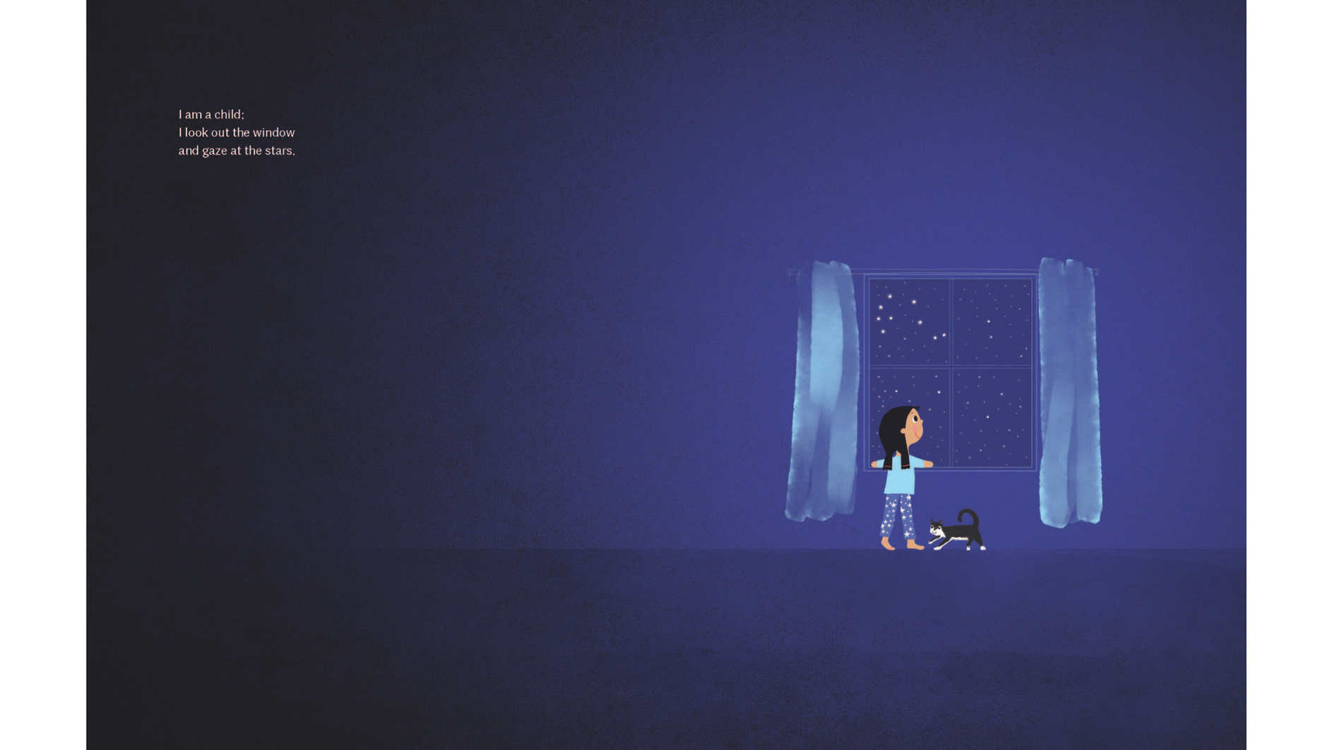
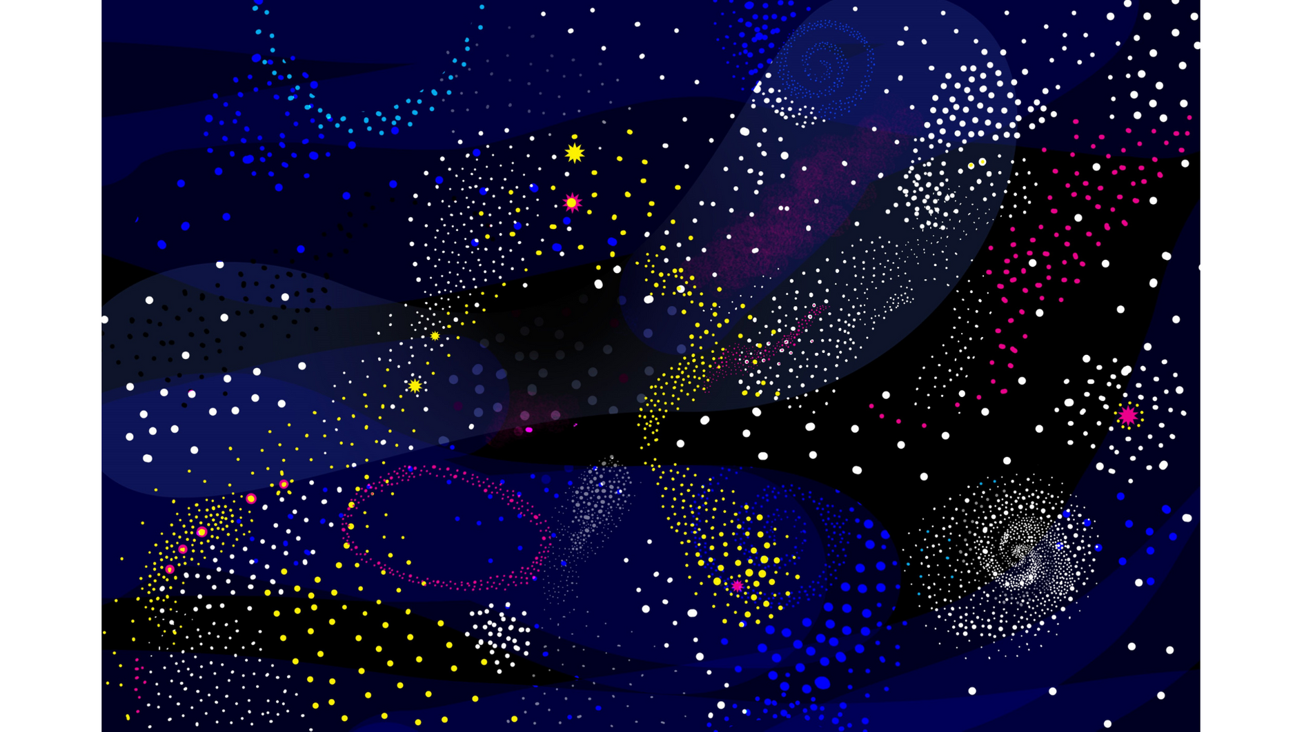
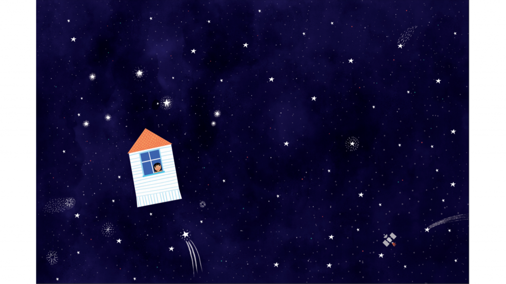
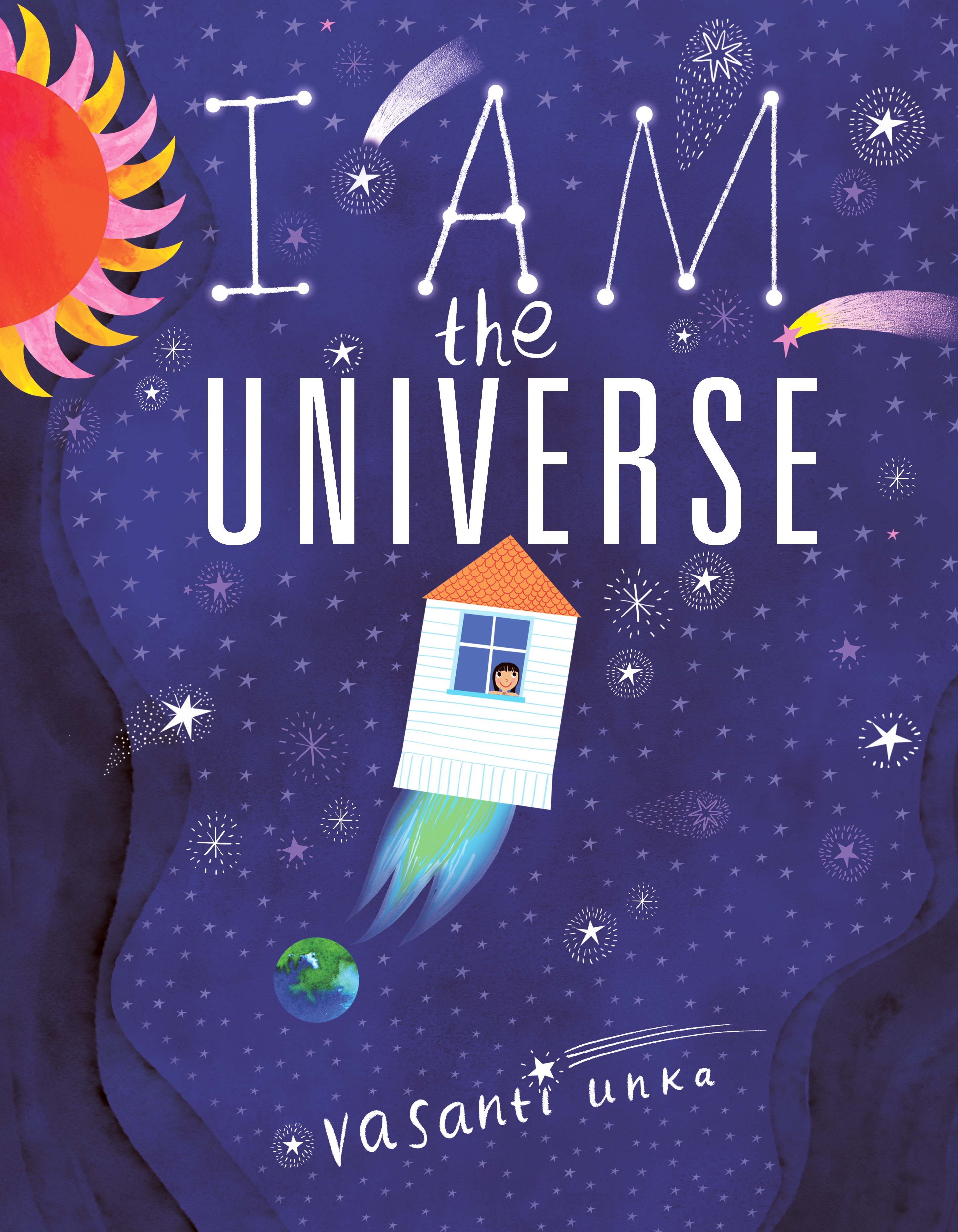
Kaleidoscopic illustrations fill each page, as readers are guided through the galaxy and solar system to Earth, and all the way down to a family and eventually a single child, before drawing the reader’s attention back to the infinite space of the universe in the final spread. Judicious labelling of elements of the solar system, atmosphere and continents introduces non-fiction elements to this joyful journey through the universe.
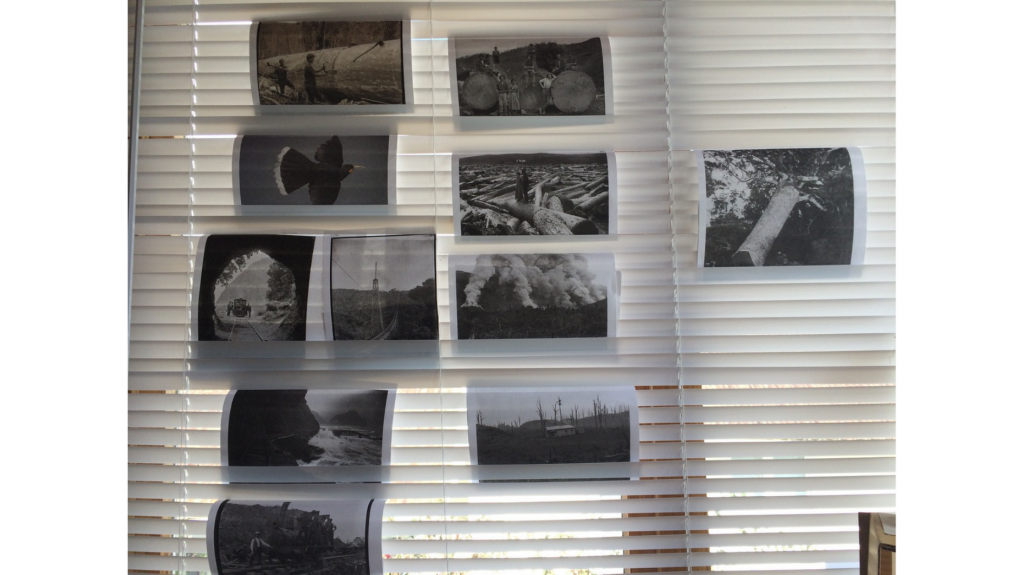
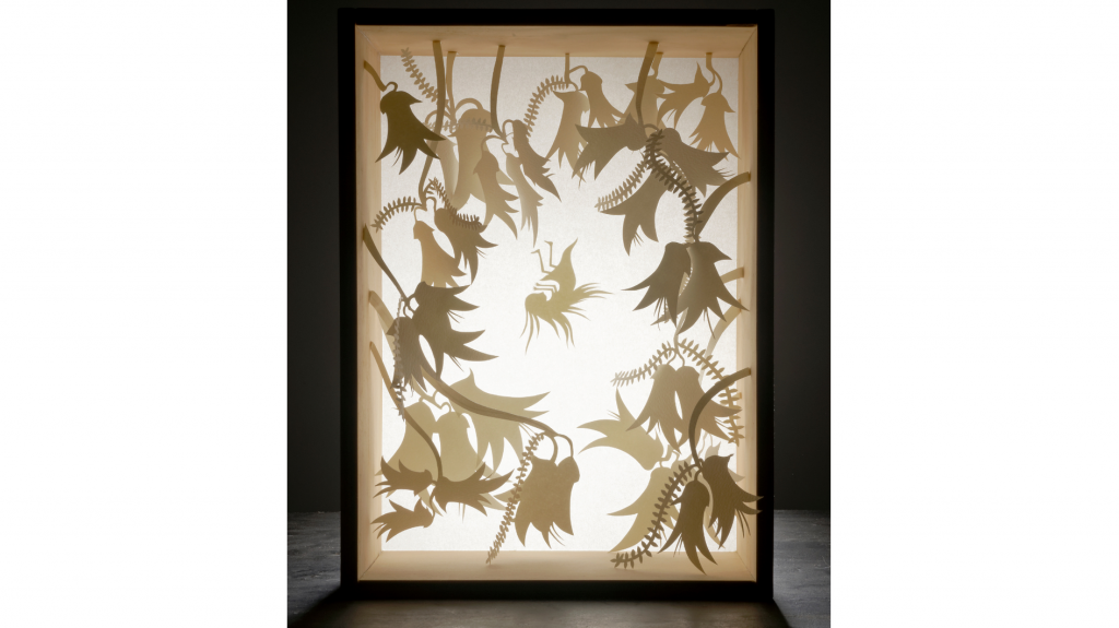
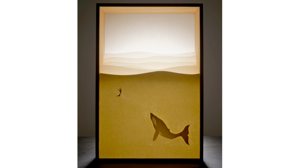
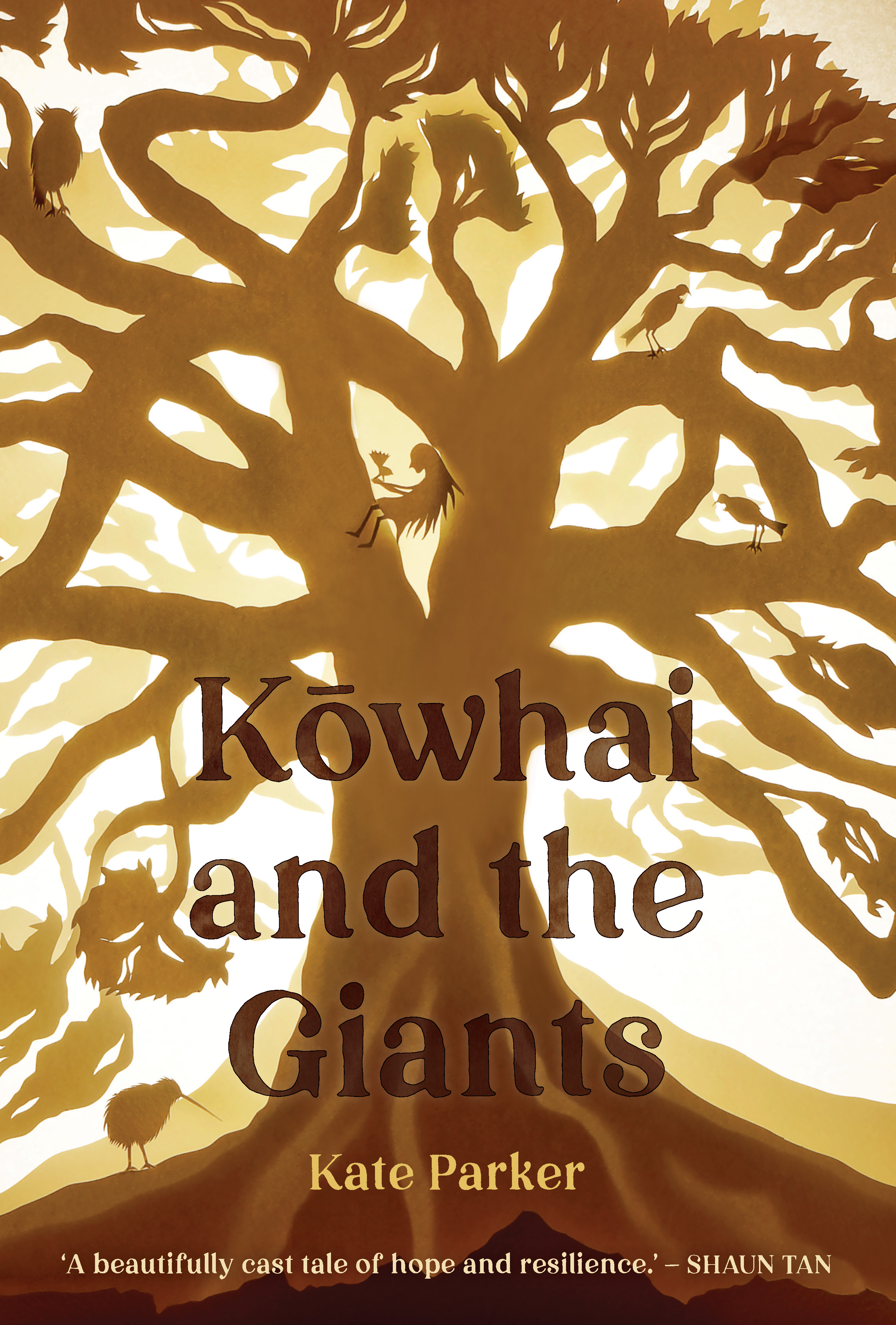
We follow Kōwhai in her mission to bring back the giant trees of Aotearoa’s forests. Illustrations complement the poetic text, offering a range of perspectives and a truncated history of Aotearoa. Based on a shadow box exhibition at the Arataki Visitor Centre in 2016/17, the illustrations capture a sense of their original three dimensions using a palette of kauri browns and kōwhai golds.
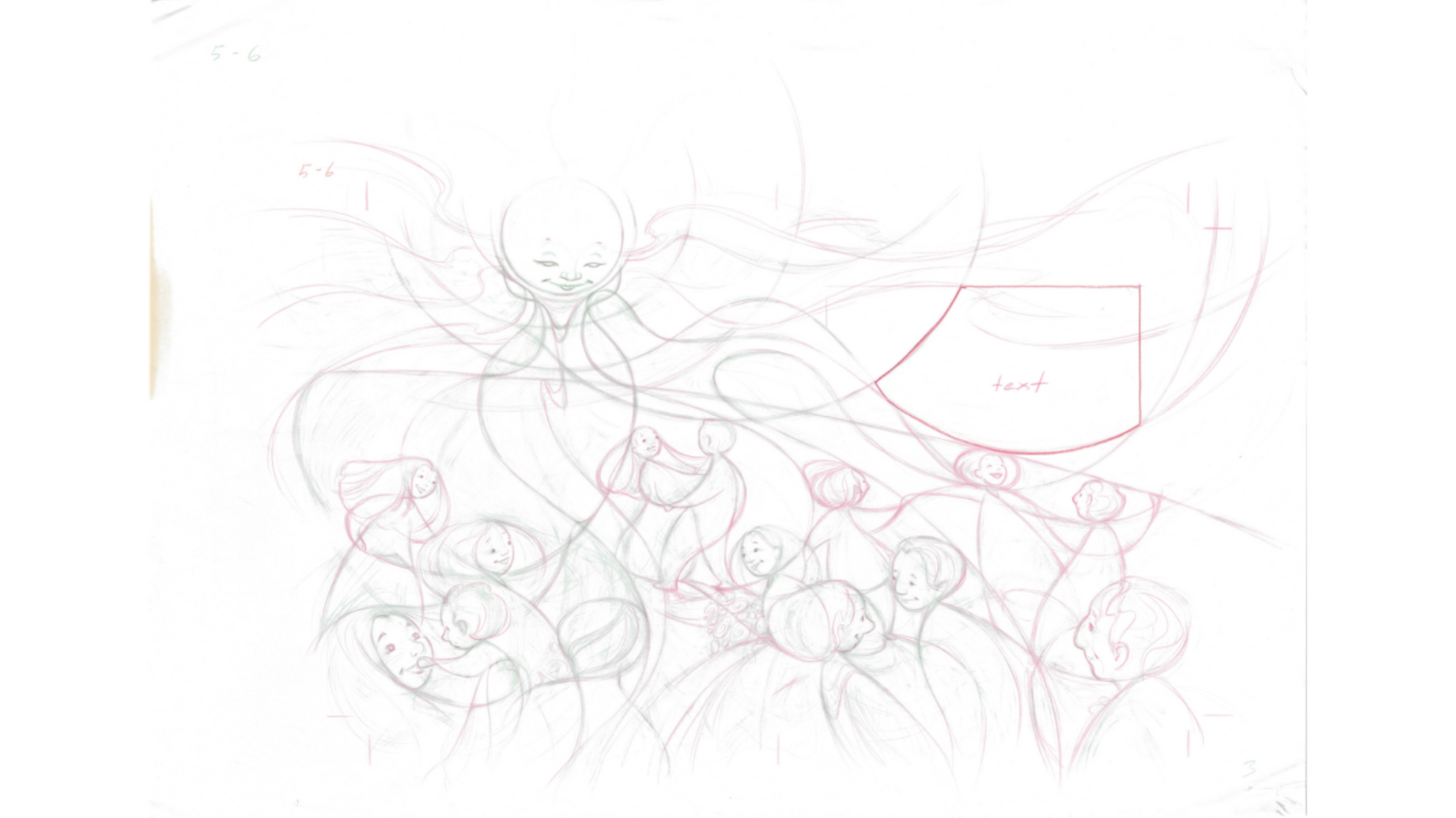
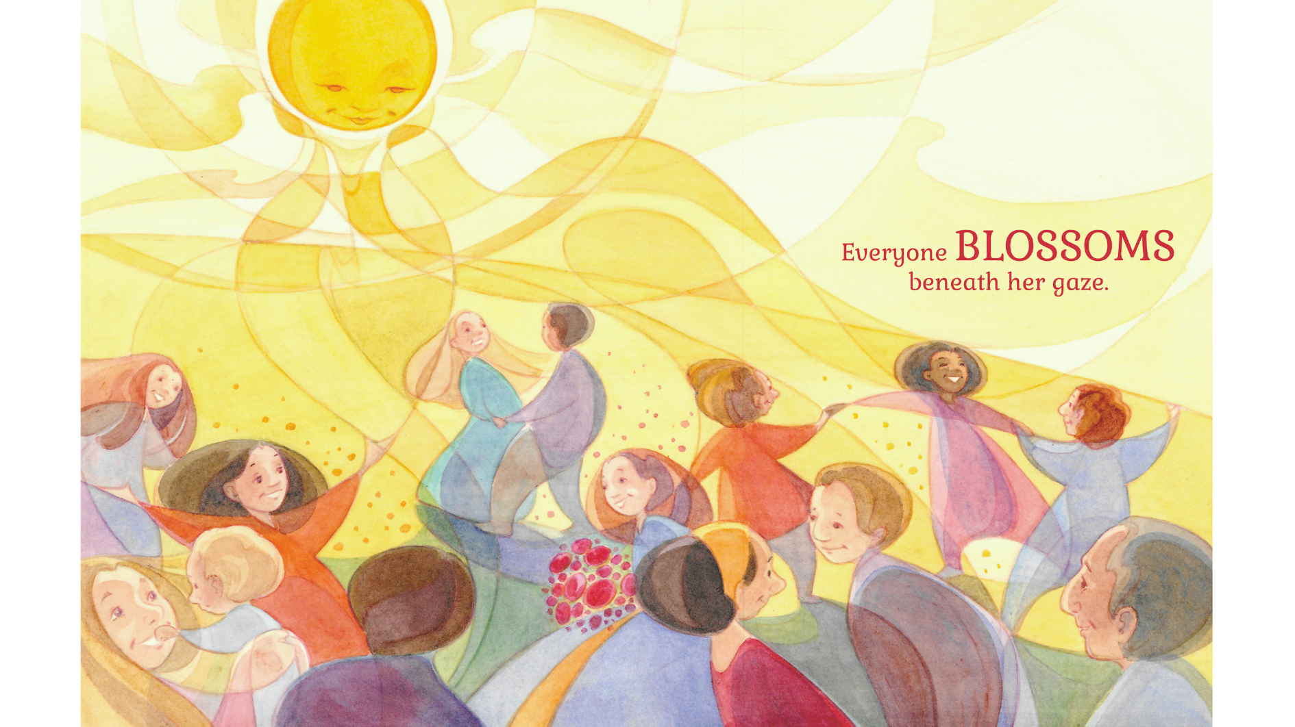
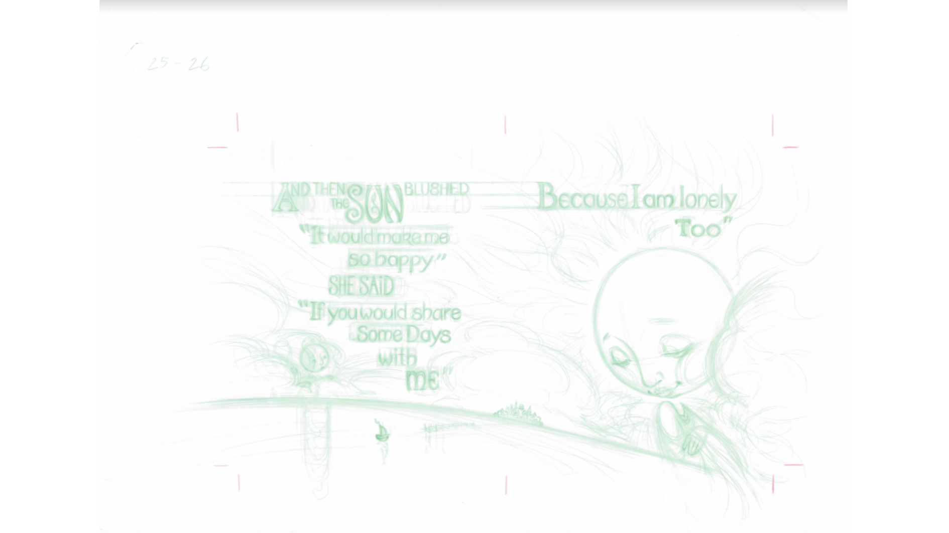
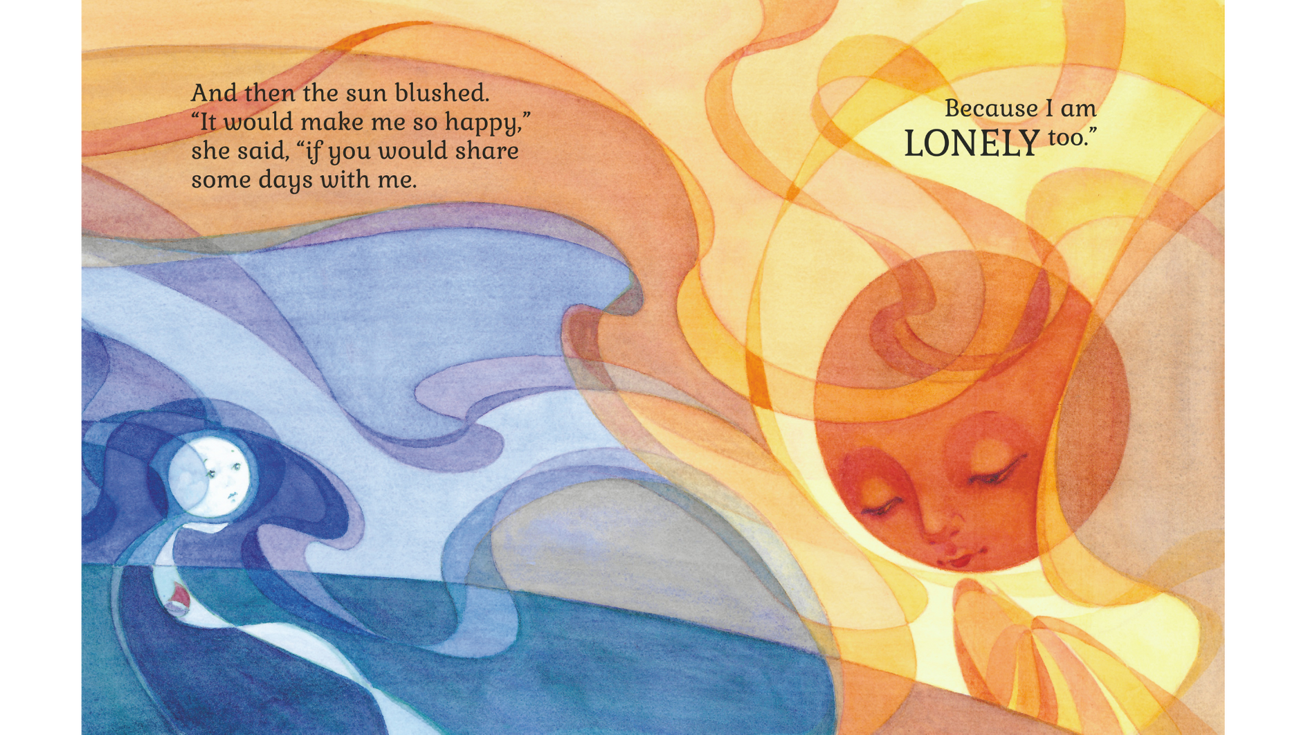
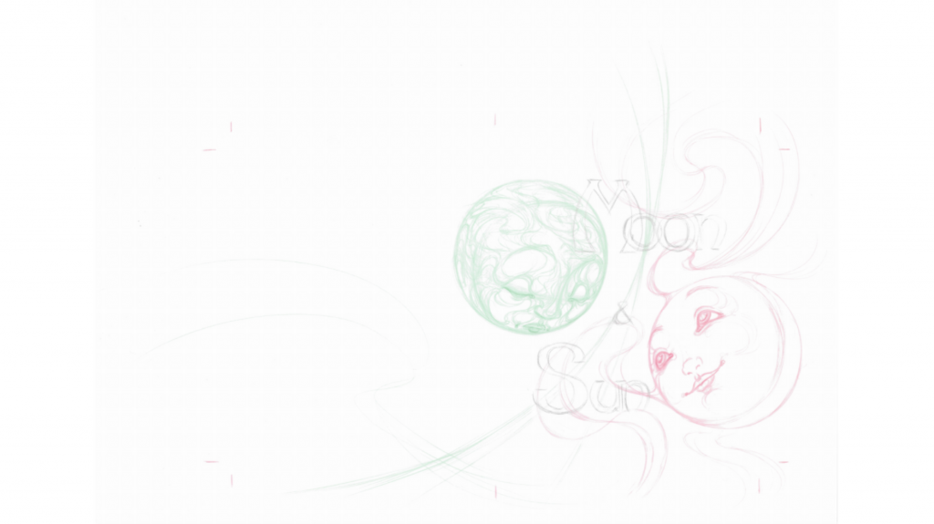
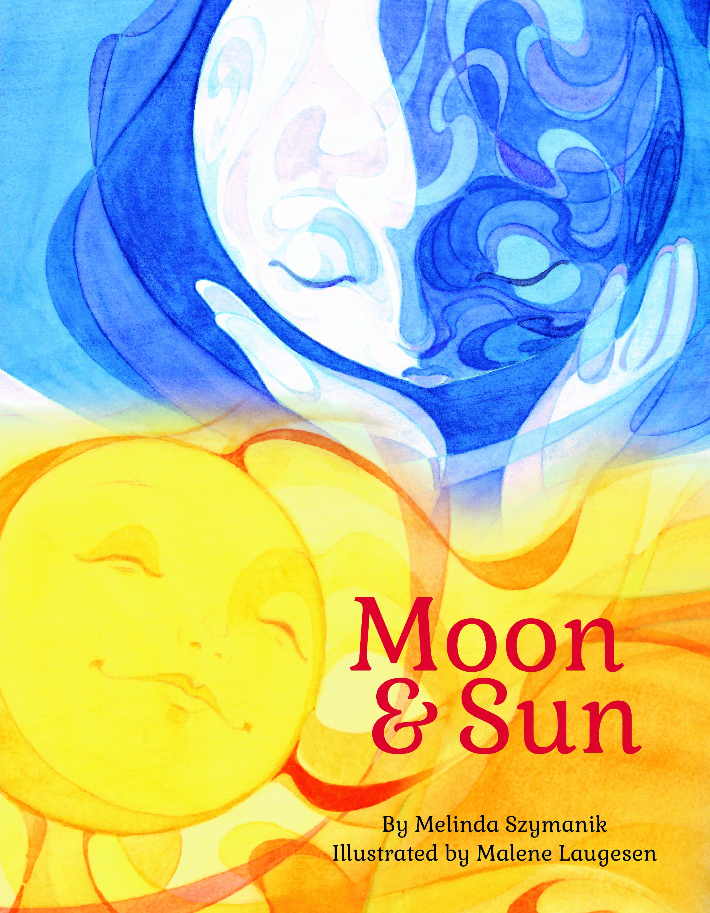
Moon envies her bright and beautiful sister Sun and feels dull next to her. Told from Moon’s perspective, deep blue skies and bright yellow sunshine are in counterpoint in this tale of their complex relationship. Multiple curved lines flow across each unframed watercolour spread, carrying readers along through the story, while the colours and facial expressions of the personified astral bodies convey the emotion of the text.
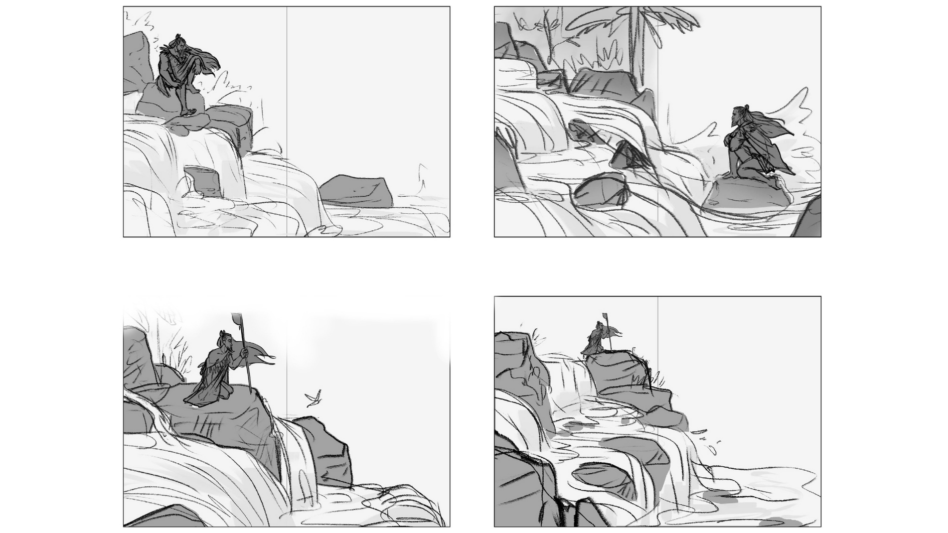
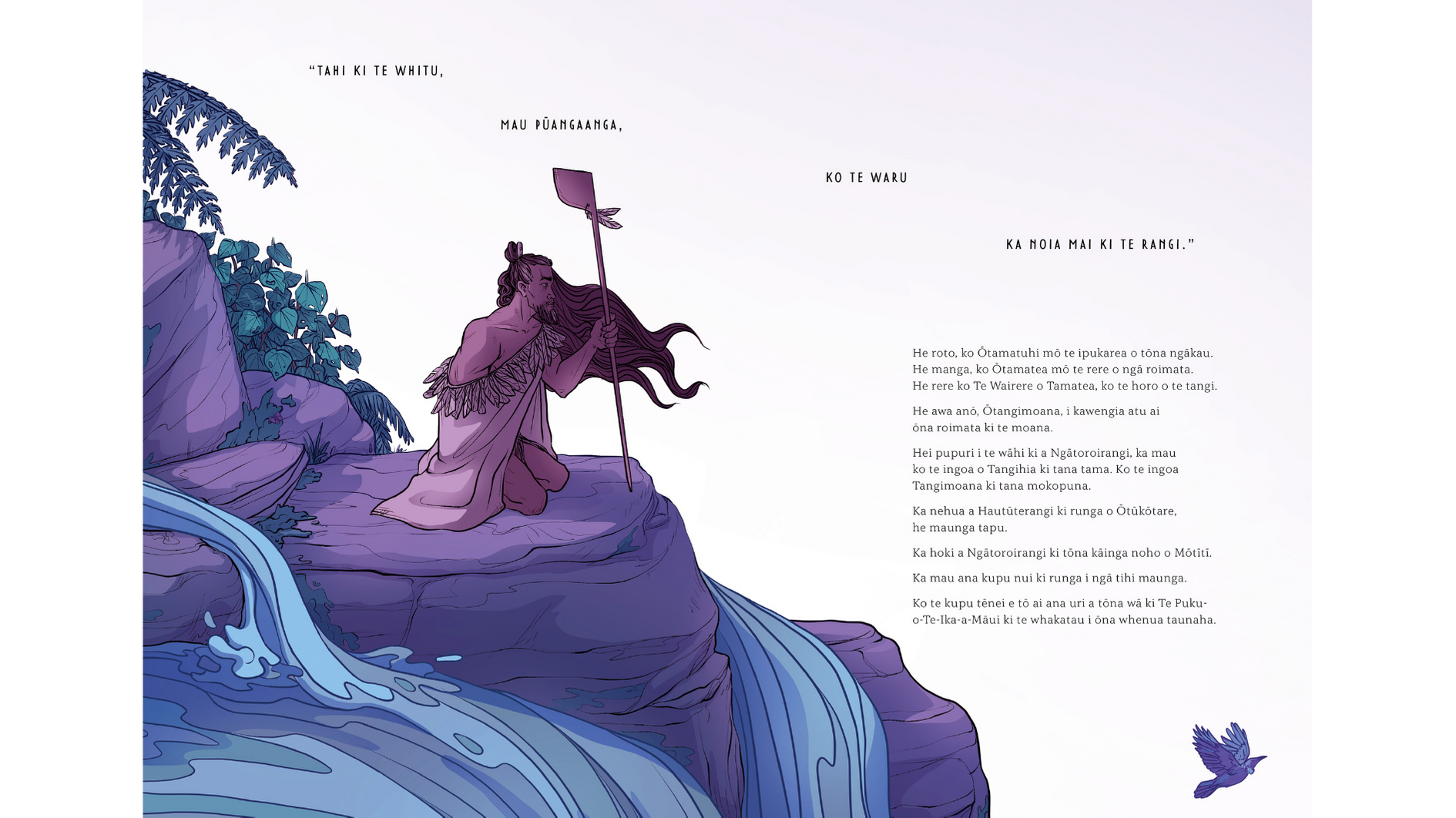
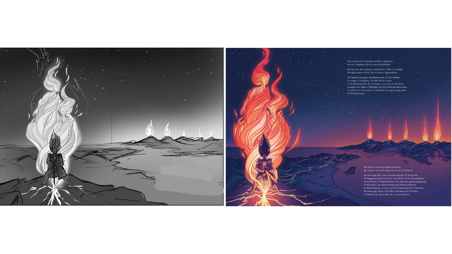
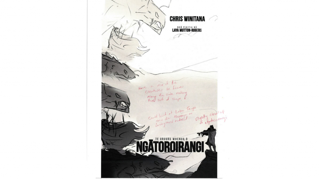
Colour and line are used powerfully to enhance the journey of Ngātoroirangi around the Central Plateau. Deep blues and teal greens depict the waters of the Waikato and the Rangitāiki rivers, and vibrant orange and reds illuminate dark backgrounds at Ketetahi. Spiritual elements are cleverly interpreted, and movement is ever present, with dramatic jagged lines in moments of high tension and curved flowing lines in peaceful scenes.
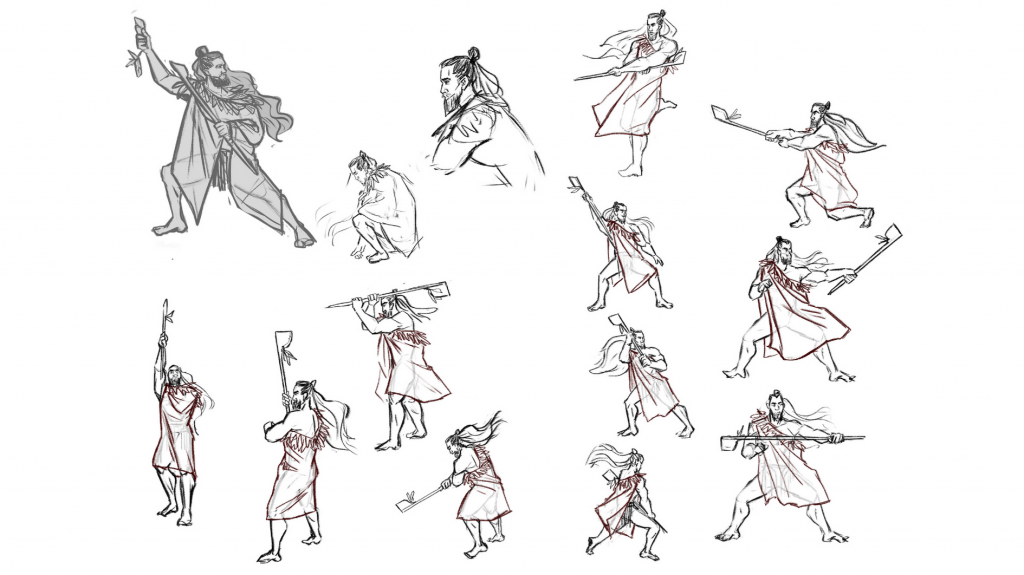
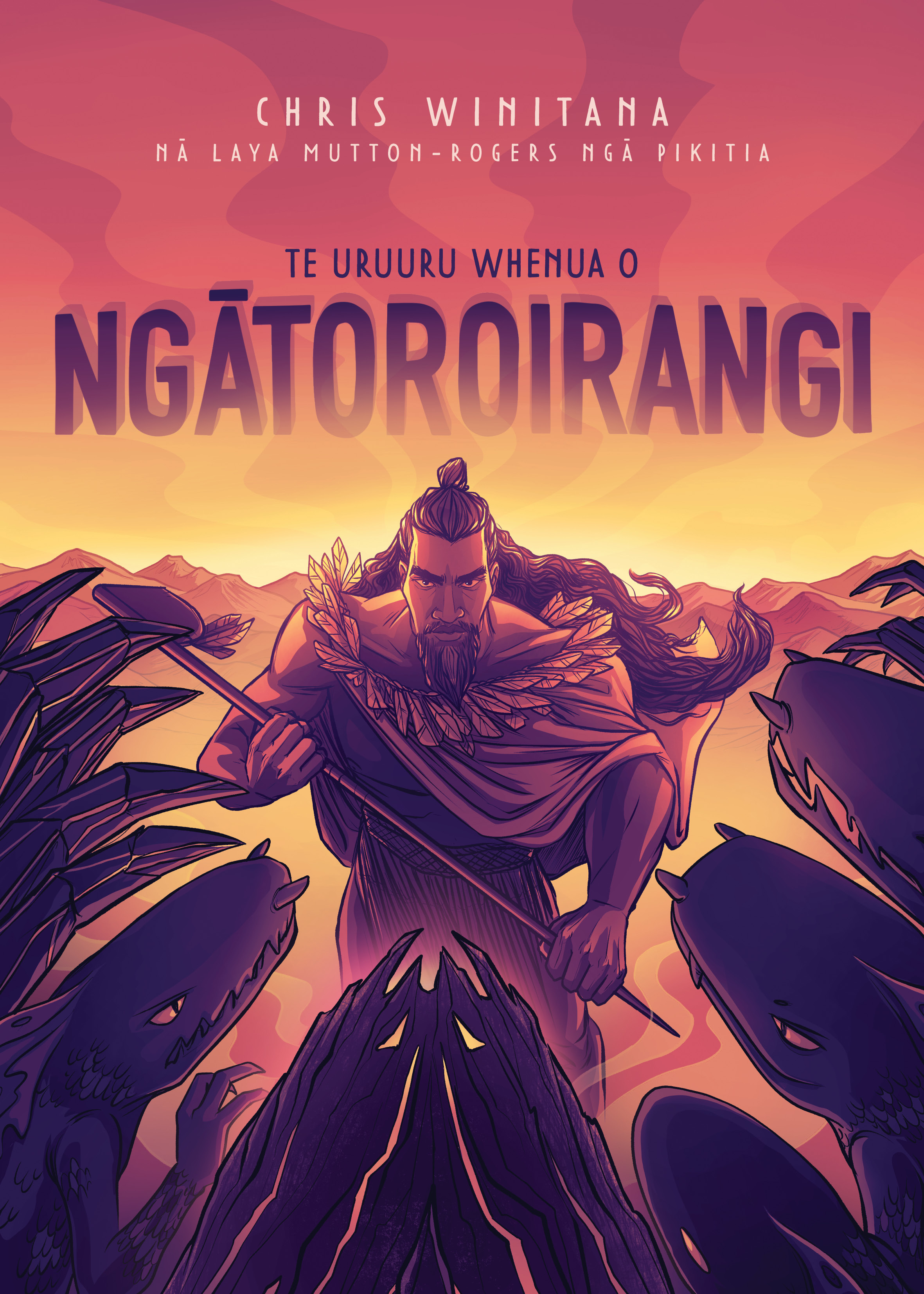
Te Uruuru Whenua o Ngātoroirangi
Illustrated by Laya Mutton-Rogers
Published by Huia Publishers


